
TL;DR: GOR2019 was a good conference, but unfortunately design (as in visual appearance) tend to be seen as an extra of low value. Hopefully next year more attention for that.
This week we visited GOR 2019 (General Online Research), a conference about online research, organized by DGOF in Cologne, Germany. The conference has a focus on marketing research, which is not our primary focus, but since a lot of projects are being done in this field (and a lot of money goes around in marketing research), we thought that this would be chance to learn a lot.
Wednesday: workshops
We started with a workshop by professor Gernot Heisenberg of TH Köln about using Microsoft Power BI for making reports. Although we see that Power BI has some very strong points, especially want you want something fast from Excel and other data sources, we think we prefer to focus on R and Shiny for making flexible dashboards. But you never know. At least now we know the very basics of Power BI.
In the afternoon we attended a workshop by Vera Toepoel and Anne Eleveld about design for mobile surveys and about using sensors. What we learned here:
- In the era of online surveys that were taken on large screens (until 2013), the maximum of time you should take for the survey was 20 minutes, was the common knowledge. For mobile phones this now should be much shorter, since people using their phone are on the go and will much more easily stop and go and do something else. A maximum now would be about 5 minutes. Which means drastically shorting your surveys or perhaps cutting them up in multiple surveys that are presented in several days or weeks.
- When designing for multiple devices, there is constantly the question: should I optimize for each device or should I make something that adapts to the device? The best approach here seems to lie at least in making the questions look alike on all devices, so when using mobile devices skip the grid questions (arrays) that make the user need to scroll horizontally. Using large grids will either result in looking differently on the different devices (horizontally on wide screens, vertically on mobiles, when using a responsive design) or it will only display the most left columns of the grid on mobiles, because the columns more to the right do not fit on the screen.
- In the Netherlands about 25% of all surveys is filled in on a mobile phone, so you will nearly always be designing for mixed mode. In Africa nearly all people fill in via mobile.
- Some larger companies have developed apps for better user experience (UX) in surveys, but they fight with the Christmas effect: many people get a new mobile phone for Christmas and do not install all Apps they had before, so panels may lose members after Christmas.
- Using mobile phones people use less and less radio buttons and checkboxes, due to the newer designs in Android and IOS. Radio buttons and checkboxes tend to look old-fashioned in surveys.
- Sliders in questions are seen a lot nowadays, but there may be a question about the answer quality, since people like to fidget with them, and possibly leave the slider in a position that does not reflect the answer that was in their mind. This may especially be the case when using sliders with beautiful effects, like animated smileys. A way to overcome this could possibly be to use the “Visual analogue scale” as promoted by Frederik Funke, one of the people of LimeSurvey. He told me that he wants to build in this question type as a variant of the slider. The main difference from the visual analogue scale from sliders are: there is no handle when you start, just an empty scale. And when you have clicked somewhere in the scale, a indicator appears. This indicator cannot be dragged, but it can be repositioned when you click on anther position on the scale.
Thursday and Friday: presentations
We visited many presentations. A brief oversight of what we thought was worth mentioning:
- Above doing research using surveys, there is the big question if research through really mining in meaningful data, like that from behavior on the net, from sensors in the streets and in devices, will give much better insight in what products sell better than asking people what they prefer. Traditional market research want to understand the customer. Modern, data driven research (called the “Data first model”) does not care about understanding the brain of the consumer, it wants to catch the decisions after several stimuli. The consumer may stay a black box. An example of this is the more frequent use of A/B testing, where only the preference of a new design is tested, not what the user thinks of it.
- When scientists and market researchers talk about the design of a survey, they talk about the question types, the order of the questions and how answer options are presented (horizontally versus vertically). The do not talk about fonts, colors, font sizes and the associations that people have with visual design in the way user interaction people talk about this. In one astonishing example a presenter told about the difference between a adaptive (I guess she meant responsive) design, versus a vertically optimized design and a horizontally optimized design. She presented many tables with data, explaining that a adaptive design scored worse that the other two, without even showing one of the designs. She left me puzzling.
- In a presentation Vera Toepoel (again) presented the findings on Research Messenger, a tool we were happy to co-develop on with Dennis Sewberath, the original developer. The findings were that the tool delivered more or less the same results, but it also resulted in several happy responses from people that praised the new design. The Research Messenger is a chatbot-like way of presenting a survey in the form of a Whatsapp conversation.
http://www.researchmessenger.com - Open questions are being subject of new discussions, since earlier results showed that people type less characters on a mobile phone than on a “normal” keyboard. This changes in several ways now: more and more people are used to typing text on phones (Whatsapp, SMS, Facebook comments) and maybe (my assumption) people are typing less on normal keyboards when answering surveys, because they just want to get it finished. One very interesting presentation talked about how to present an evaluation about the survey at the end of the survey. Long discussion short: the recommendation was to firstly present an evaluative question: “How did you experience this survey?”, flowed by an open question where people can leave remarks about the survey.
https://www.gor.de/gor19/index.php?page=browseSessions&form_session=43&presentations=show (last one on this page) - Another way to approach this on mobile phones could be the possibility to use spoken text as a way to collect answers to open questions. Voice messages can then be interpreted by a Google API, that transcribes these vocal messages. Especially for people that do not like keyboards on mobiles (often elderly people) and people that are afraid of making spelling errors in their written messages may benefit from this. We did not hear any privacy issues expressed by people at the conference, but we do think that privacy issues may arise here.
https://cloud.google.com/speech-to-text/ - Paul Simmering presented a great R Shiny dashboard for showing patents in Europe. What struck me was that this was seen as innovative, while R Shiny is already several years old.
http://www.gpxp.org 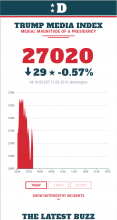 One of the best presentations in the sense that people laughed a lot was done by Marcel Gemander. In 15 minutes he presented “Perhaps the most important graph ever…”, a graph that tells about the utterances of Donald Trump in the press and on Twitter. His presentation focused on a graph that initially was rather dull, but by spicing it up with the right design, could be presented as something very important. Take a careful look at the formula he used to compute the Trump Media Index.
https://www.marcelgemander.com/donaldsays- If you want to invite people for a survey using a smartphone, you will have to send twice as much invitations as when you want to invite people for a survey that is to be filled in on a more static device (laptop/desktop)
- People rarely rotate their screen once they have begun filling in a survey.
- When you use a Likert scale (5 point scale), you will find out that people that do not know the answer, fill in the middle answers, since that is considered to be neutral. If you add an extra option “Don’t know”, you will attract less “Neutral” answers. Research found out that the reason for filling in the “middle position” (when there is no “Don’t know” option) can be:
- Really do not know
- Cannot decide
- No opinion
- Not interested in the question
- (And maybe, my addition) I do not want to express myself on this issue.

Conclusion of the research: adding a “Don’t know” option does not add to the answer quality, although it may respect the respondent that does not know how to answer more.
- Should you use semantic scales or numeric scales or a combination? When using smaller screens it is tempting to use numeric scales. No text would lessen the burden and possibly give better data quality was the assumption. The researcher compared these two scales:
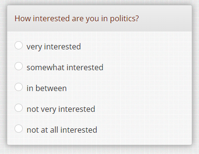
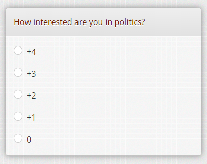
and she found out that when you offer the numerical scale, people tend to score more on the extremes (0 and +4) than when the semantic scale is offered. I think that this experiment is incomplete, because a scale of 0 to +4 (why is the plus sign used?) people might think that the scale could be longer, like 5, 6 or 7. I think that when you offer a scale using the values 0, 25, 50, 75 and 100 gives much more the feeling of a closed scale.
We hope that this gave you some insight. Please evaluate just the way as described on the conference!